The Art of Travel Posters
This blog was written by Warwick Brown, Walsh Memorial Library volunteer
A constant flood of colour imagery on TV and computer screens, and in magazines, is now part of our daily lives and it is hard to imagine an age when most illustrations were in black and white. Posters have been around since Roman times, but it took two discoveries to make printing colour posters an economic proposition.
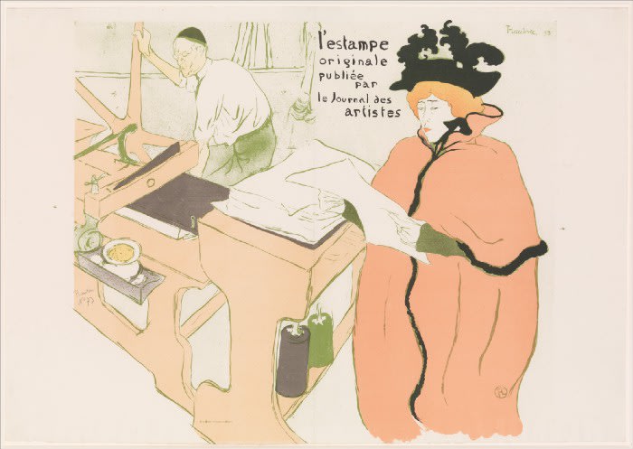
One of these was stone lithography, invented by Alois Senefelder in 1796. It involves drawing on a limestone block with a greasy crayon or an oily liquid (tusche). When the block is wetted and ink rolled over it, the ink sticks to the greasy areas and not the wet ones. By placing paper on the block and passing it through a press a perfect copy of the marks is made. This process requires a separate block for every colour, but a skillful printer can often get more than one colour on the stone at once and, with overlays, produce extra colours. A good lithograph is almost indistinguishable from a colour drawing (except the image on the stone is reversed). By the late 19th century this medium was being used extensively in Europe to produce billboard posters, some by famous artists such as Jules Cheret, Henri Toulouse Lautrec and Alphonse Mucha.
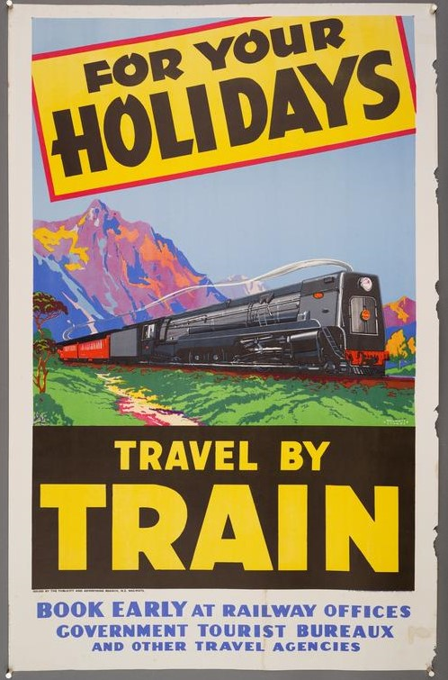
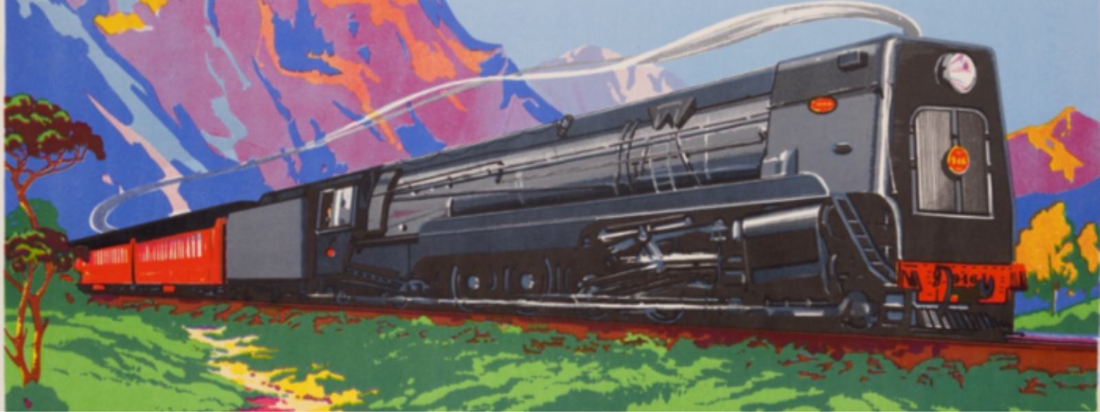
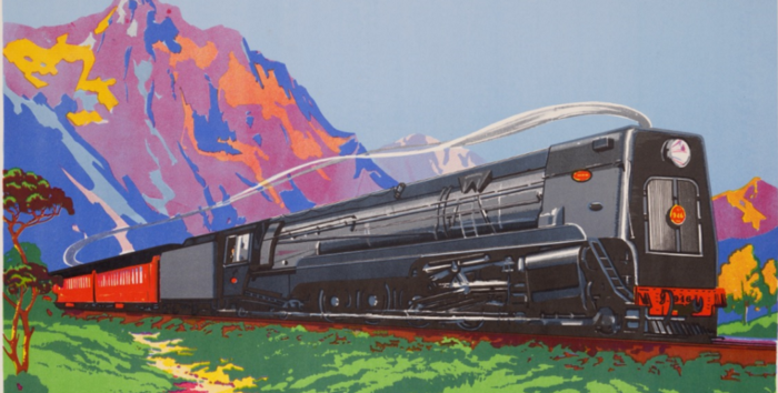
The second invention was screenprinting, in use by the Chinese since about 221 a.d. but developed for commercial use in the early 20th century. Here the image is produced by blocking out parts of a taut silk screen, then pressing ink through the screen onto paper with a squeegee. Again, a separate screen is required for each colour. Printing does not reverse the image. A picture that is to be reproduced by screenprinting has to be simplified into small sections, each of which will represent one colour. As a result a screenprint usually has a different look to a lithograph; it is like a jigsaw of flat coloured shapes and has more visual impact. MOTAT’s posters display all this clearly. The colourful peak in the background of the screenprint For your holidays travel by train is made up of six different hues that blend together in the eye. Careful inspection shows that there is no blurring or shading between colours, such as one may find in a lithograph.
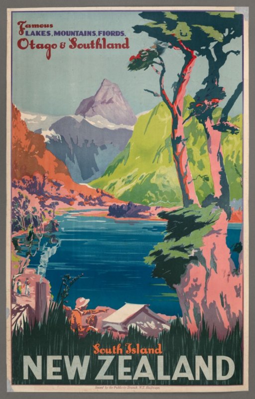
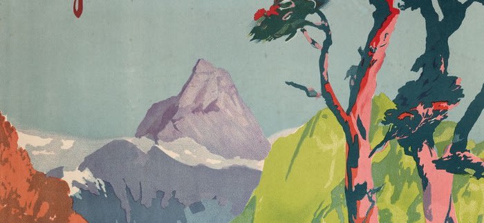
Famous lakes, mountains, fiords South Island looks like a screenprint but is in fact a lithograph. This becomes clear on close scrutiny. Mitre Peak in the distance was drawn on the stone with a crayon. Crayon work is also found in the fine shading in smoke from the chimney, on the green hillside and here and there in shadowed areas. The areas of block colour were painted on the stone with tusche. The poster is made from at least ten separate colours.
Nineteenth century posters were largely freely hand-drawn. By the 1920s photographs were often used by the poster artists as the sources for their graphic works, giving them a convincing real-life look. Artistic skill was required to eliminate detail, balance text and images and maximise visual impact. Later developments introduced photography directly into the processes (photo-lithography and photo-screens) and this resulted in even more realistic images, but the art and expertise involved in the older reductive processes was largely lost. That is why the MOTAT collection of classic railway posters from the decades of the 20s, 30s and 40s is so valuable and interesting.
As noted above, there were no TV or computers pre-war; even most movies were in black and white. The New Zealand Railways wanted to promote rail travel for fun, in addition to its commuting and freight services. What better way than to produce exciting, enticing colour images of out-of-town attractions like Rotorua, Waitomo and the South Island? These posters could readily be presented to the public at large in the railways’ numerous station buildings, but also overseas in travel agencies. Rolled in a tube they were easy to ship around without damage.

Today there are hundreds of contemporary artists in New Zealand making a living from pure art. Before the Second World War there was only a tiny handful. We had no Matisses, Picassos or Mondrians here. Young people wanting to make a career in art could study at art schools but practically had to become ‘commercial’ artists. Advertising studios such as that established by the Railways Department in 1915 were one source of employment. These studios were managed by academically qualified persons, often brought in from overseas, and were well equipped. Consequently, world art styles had an influence on local poster design, just as they did on craftspeople, fabric designers and architects. As Modernism, with its distortions, free use of colour and simplified forms, gained acceptance, the sinuous Art Nouveau styles used by French poster artists such as Mucha gave way from the 1920s to Art Deco influences. That simpler, linear style dominates the MOTAT posters. The emphasis was on impact — clear, easy-to-read and eye-catching, with just one or two dominant images such as a speeding train, an airborne skier or a bathing belle.
The names of the individual artists are mostly now unknown, but the works they produced, no longer fulfilling their original function, live on as true art. It can be argued that the poster art of the 1930s broke the ice of 19th century conservatism and paved the way here for the wide public acceptance of contemporary art from the 1960s onward. In that regard, one modern art movement that has proved popular in New Zealand is Regionalism, emanating from America in the 1930s, and influencing such artists as Christopher Perkins, William Sutton, Rita Angus, Rata Lovell-Smith, Doris Lusk, Don Binney, Robin White and Michael Smither. Implicit in that style is the same bright colour, simplification of forms, elimination of fine detail and celebration of landscape embraced by the poster artists. Screenprinting as a pure art form also emerged strongly here from the 1950s onwards. Today a screenprint by Don Binney or Patrick Hanly can fetch many thousands of dollars.
